An Evolving Website
In an attempt to encourage myself to post more, I’ve given my website a design refresh! Whether this tactic works or not remains to be seen, but it prompted me to look through all of my old site designs. I thought it’d be fun to post them here.
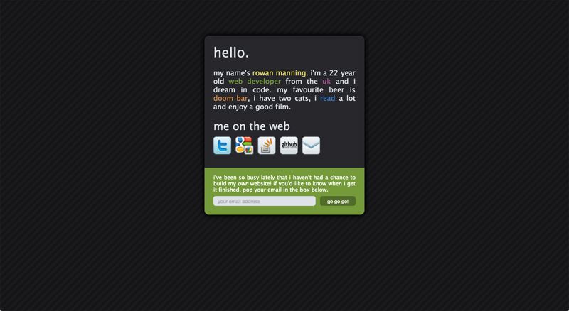
2010 aka “Corners and Shadows”
Diagonal Lines! Border Radius! Box Shadows! Bright Colours! I think this design really pops, don’t you? Just look at those icons. Yes, that is Google Buzz (I guess I was optimistic).
Here’s a fun fact which embarrasses me now: several interviewers said that mentioning beer on my CV/website is part of the reason I got an interview. Bro.
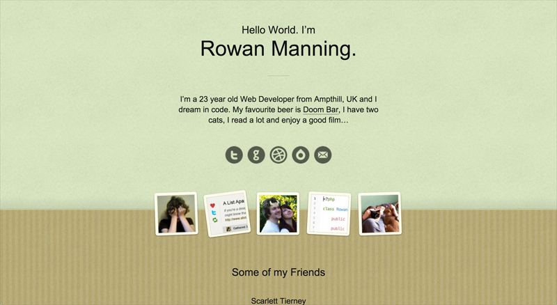
2011 aka “Jaunty Angles”
Look at those images! They’re not straight, and I’m doing it with CSS! This design reminds me of a wallpapered wall with a border, but in the house of somebody with no style. Thumbnails defining me include:
- Me with my head in my hands. Yep, still applies
- A design for a project that never got finished. Yep, still happens
- Me with my cats. Yep
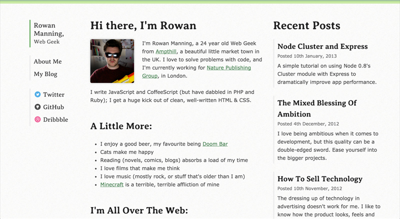
2012 aka “Birth of a Blog”
Finally, my site does something more than advertise the fact that I like beer! Actually this is the point where my current green colour entered the scene, as well as that bar across the top.
One aspect of this site needs tearing down. Look at that profile picture. BRB – I’m going to curl up in a ball for a while. I oddly decided that for a home page, this image and some “about me” text was more important than the posts.
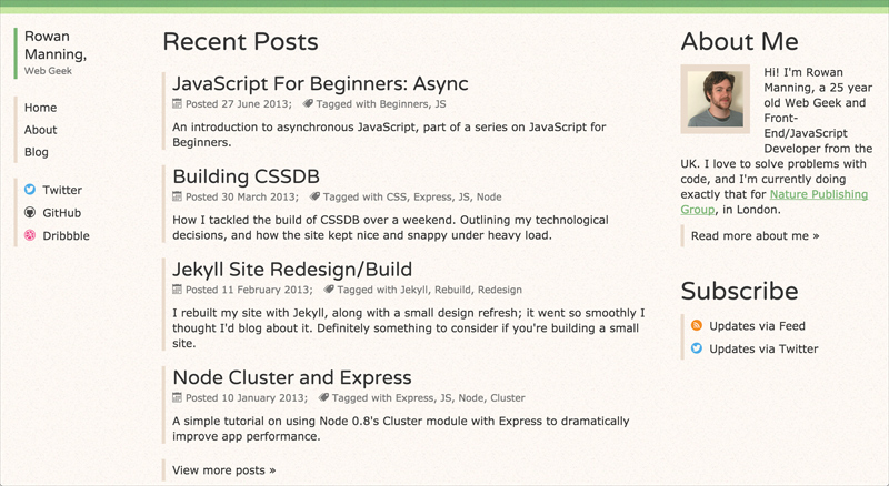
2013 aka “What the Pinky Cream?”
OK what’s going on here? “What’s with the pinky cream?”, I yell at past-Rowan. At least in this design I’ve switched the ordering/priority of blog posts and bio.
The pinky cream isn’t that far from FT pink. If I believed in anything supernatural I might read this as a sign that I was destined to work there.
2014 aka “Boxes and Projects”
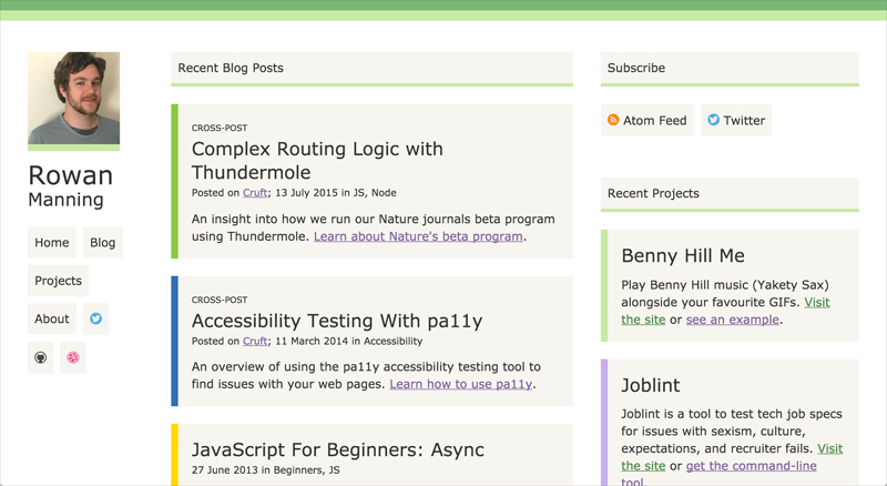
Here’s where I got carried away with Jekyll and decided that I had to use all the features. Adding projects just overcomplicated everything. I still like the individual post colours, and I’m glad the pinky cream has been tamed into slightly less pink boxes.
The green bar at the top just keeps growing, and this is the first design to not display my age anywhere.
2015 aka “Spring Clean”
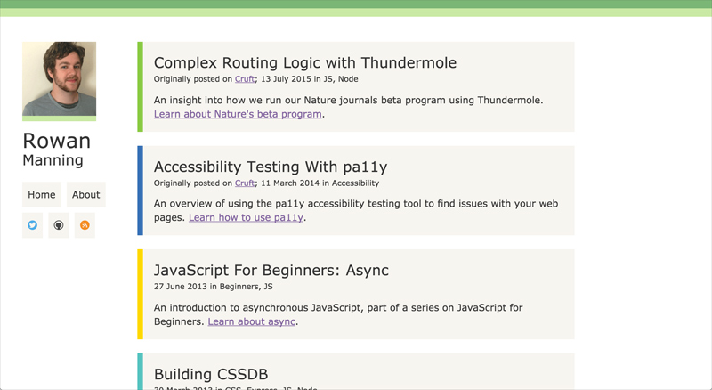
Projects are dead! There’s a lot less competing for your attention now, and I think that’s a good thing. This is probably the smallest design iteration there has been, which might mean I’m settling on something?
2016 aka “Stripped Back”
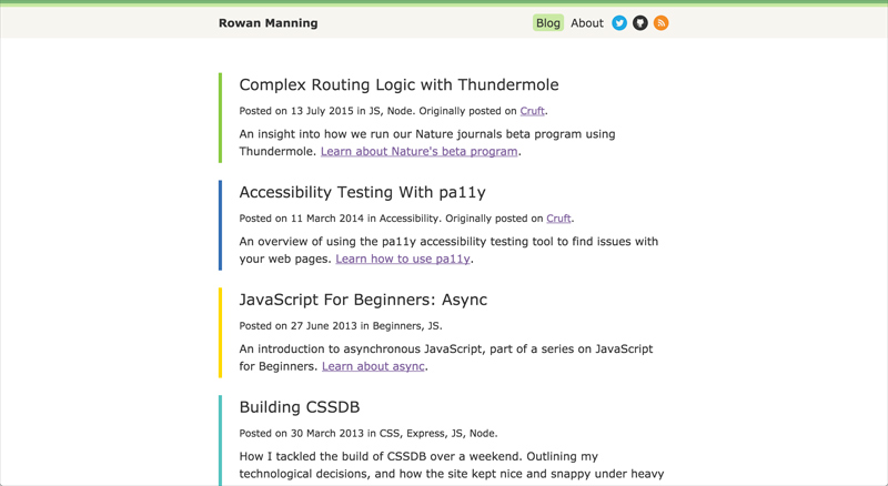
And here we are with the new design! I’ve continued what I was doing with the 2015 spring clean and really stripped back the home page to just blog posts.
I’ve kept some of the things that I now consider almost signatures of my site: the green header bar, and the post colours. I’m pretty pleased with the outcome! Fingers crossed I’ll start writing again.
Thanks for reading ☺️